Helping Wim Hof improve their 20-day Cold Water Challenge experience.
During the Memorisely UX/UI Design immersive online Bootcamp, I worked with a small team of designers from around the world. The first case study was based on improving the Wim Hof mobile app, specifically the 20-day Cold Water Challenge. I collaborated closely with another designer, focusing on solving the challenges for users of the app.
Cold Water Immersion boosts cardiovascular circulation, which supports a healthy heart, a robust immune system, well-balanced mental health, and high energy levels. Since the pandemic, cold water therapy has risen in popularity, and the most significant influencer of this is Wim Hof. Wim has developed his cold water immersion method, and his mobile app encourages those new to cold water immersion to complete a 20-day challenge. In addition, users are invited to pay a monthly or annual subscription to continue their experience during this period.
Role
User Research
Product Strategy
UI Design
Interaction Design
Usability Testing
Tools
Figjam
Notion
Maze
Figma
Otter
Timeline
5 weeks
Summary: Wim Hof App Redesign: 20-Day Cold Water Challenge (STAR)
Situation — The Wim Hof mobile app invites new users to complete a 20-day Cold Water Challenge as the entry point to a paid subscription. But users weren’t completing it. The onboarding flow had no clear hierarchy of information — too many media types, mixed icon meanings, dense text blocks, and no obvious path to begin — leaving new users overwhelmed and unmotivated to form the habit. (Memorisely UX/UI Bootcamp, 5 weeks, paired with another designer.)
Task — Redesign the experience so new users could find their way into the challenge, set reminders, and track progress easily — turning the challenge into something achievable rather than something to abandon. The framing question: How might we guide users to start the Wim Hof challenge?
Action — I led research, product strategy, UI, interaction design, and usability testing across five weeks. We started with a heuristic usability review in FigJam to map pain points and “wow” moments, then ran competitor benchmarking against Cold Water Therapy and Headspace using the LEMES framework (Learnability, Efficiency, Memorability, Errors, Satisfaction). Synthesis pointed to two frustrations: no clear direction into the challenge, and no visual cohesion across the onboarding. We ran structured ideation (rather than committing to the first idea) and mapped impact for users vs business, then built improved user flows, rapid sketch prototypes, a small Figma design system for consistency, and a high-fidelity interactive prototype focused on a redesigned home screen and settings flow. We tested the prototype with users in Maze.
Result — Testing showed users found the challenge entry point more easily than in the original app, and users specifically called out the badge system as motivating. Three key learnings shaped next steps: the “Start Challenge” CTA needed to live at the very top of the home screen (heat maps showed users tapping the circular options at the top expecting to start there), toggles needed bigger touch targets and stronger accent colours, and the badge system was worth investing in further. The hypothesis going into a v2: a clearer second path into the challenge plus refined settings would lift challenge completion — and, downstream, paid subscription conversion.
Intro: The Problem
Users don't feel motivated to complete the 20-day cold water. How can we make it more accessible for users to achieve and form a new habit?
The solution
We focused on re-designing the home screen and settings pages to create an organized, tranquil flow for the user. New users would set reminders easily, track their progress, hence feeling motivated to complete the cold shower challenge.
Interviews and usability testing across 5 weeks
Breathing exercise flows, guided sessions, progress tracking
iOS app redesign with a coherent visual language
Paired with another designer — led research and UI
Usability Review
To better understand the product, we conducted a usability review using FigJam to identify pain points and wow moments in the existing experience.
Business & User frustrations
Primary Frustration
When new users start the challenge, there is no clear direction or path for them to follow, which results in confusion and frustration.
Secondary Frustration
When new users start the challenge, there is no overarching cohesiveness. There is a video, no matching icons, and long text blocks. This leaves the user overwhelmed and unable to start the challenge.
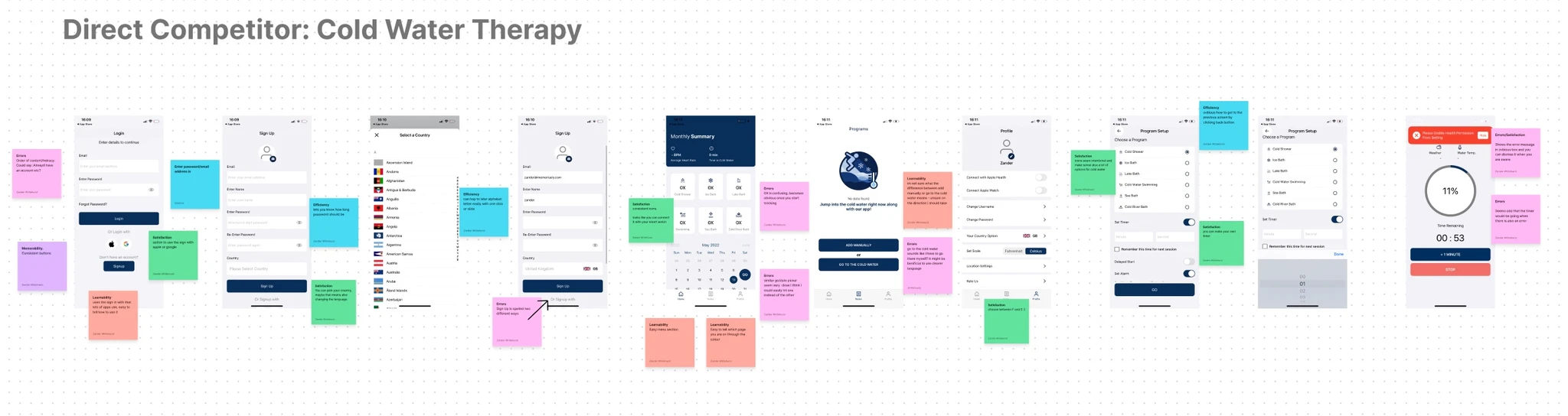
Competitor Benchmarking
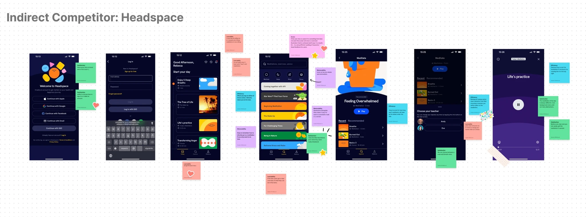
With a completed usability review, we moved on to competitor benchmarking to identify business standards in competitor products that could be used to improve the existing experience. Using the metrics of LEMES: Learnability, Efficiency, Memorability, Errors, and Satisfaction; we measured the usability of the Cold Water Therapy App and Headspace to test how easily can users complete a task.
Problem Space
The initial usability review and competitor benchmarking helped us identify the problem space to begin ideation. The app offers no clear structure to guide the user into what the Wim Hof Challenge is, its benefits, and how to start. This problem occurs because there is no clear hierarchy of information. It feels very chaotic because there are too many media types, and the meanings and associations of the symbols are unclear.
Ideation
To avoid following the first idea we conducted a series of ideation techniques. This allowed us to consider an array of solutions. Following ideation we mapped what could be improved or added to the product and what the impact of each idea would be for users and the business.
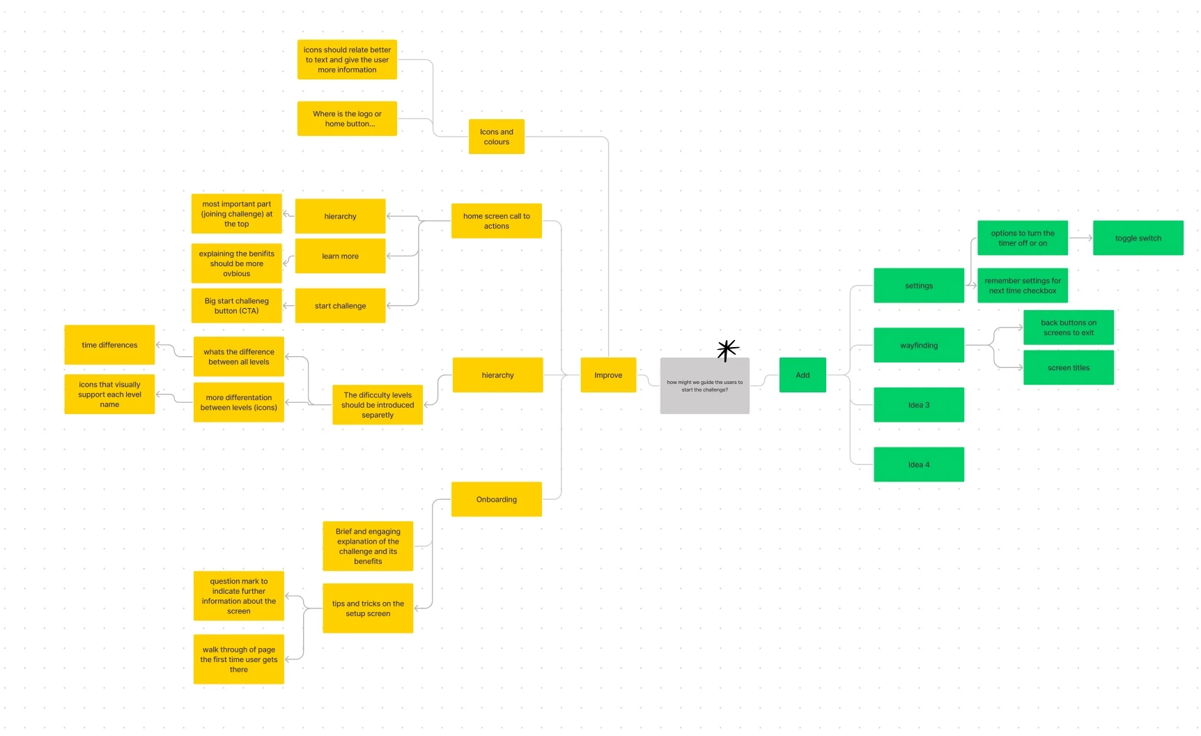
What can we add
1. Screen titles and ways to exit or go back to previous pages.
2. Explanation of the difference between timer and alarm.
What can we improve
1. More pronounced "start challenge" call to action on the home screen.
2. Succinct explanation of what each level entails.
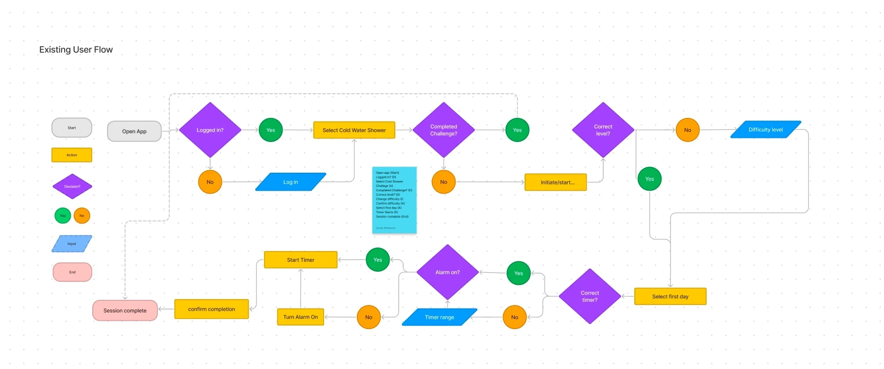
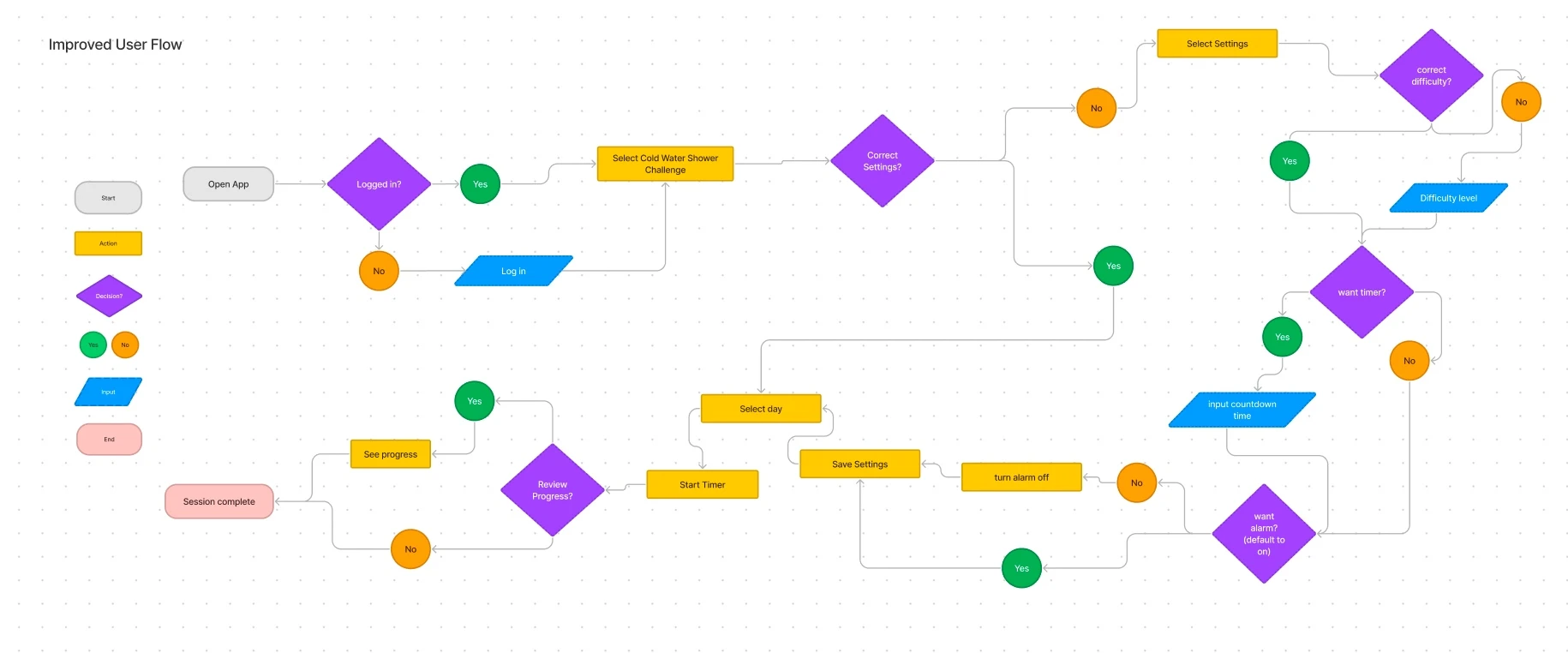
User Flows
Following Ideation we created user flows of the existing experience and improved the flow based on the idea that would fit with business and user goals.
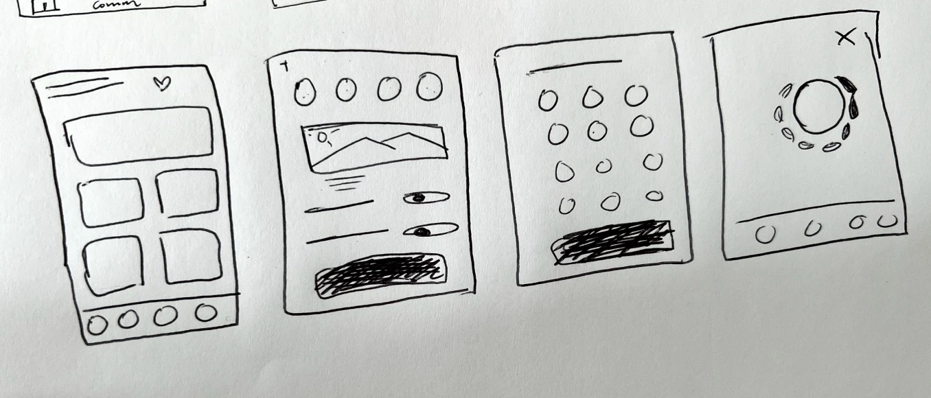
Rapid Prototyping
Having mapped an improved user flow, we rapidly drew prototypes for a solution. Sketching helped me rapidly iterate on the original idea and visualise a solution without committing too early to high-fidelity screens.
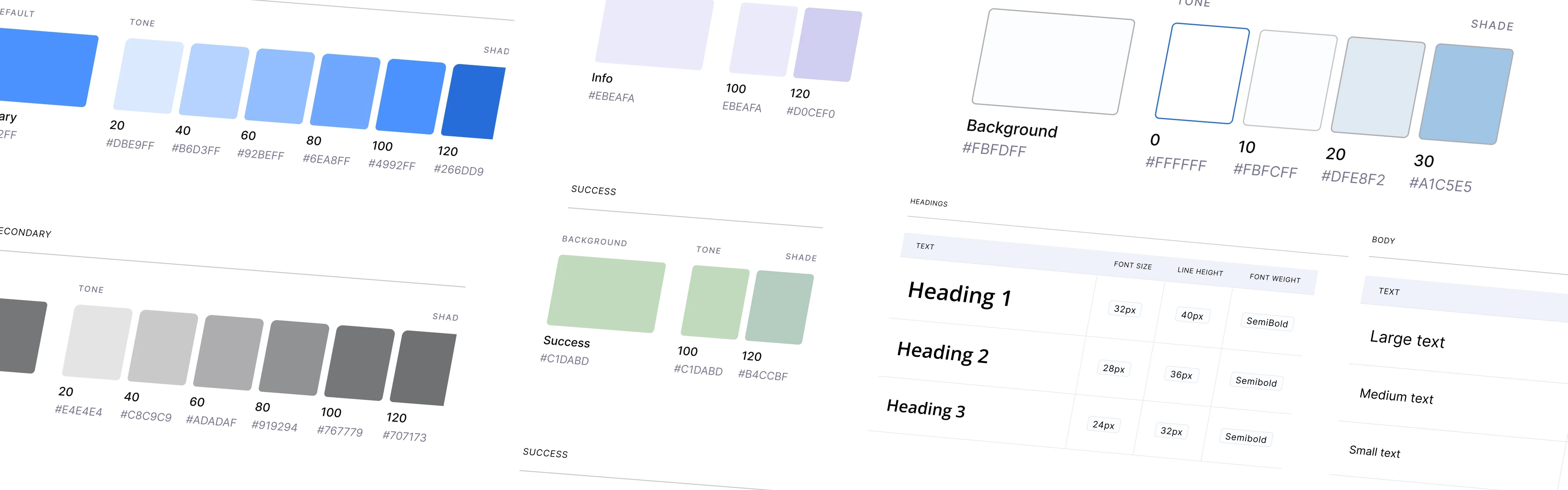
Styles & Components
Before creating the hi-fidelity prototype, we defined the product styles and interactive components in Figma to help us design consistently and quickly.
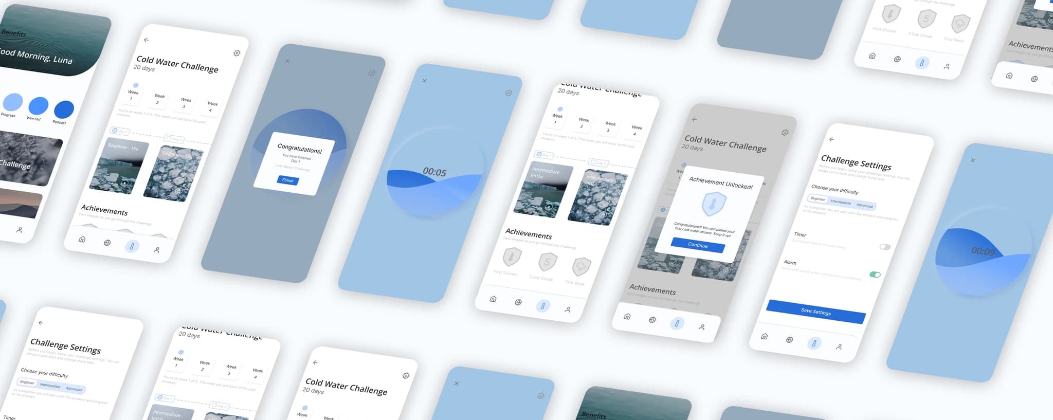
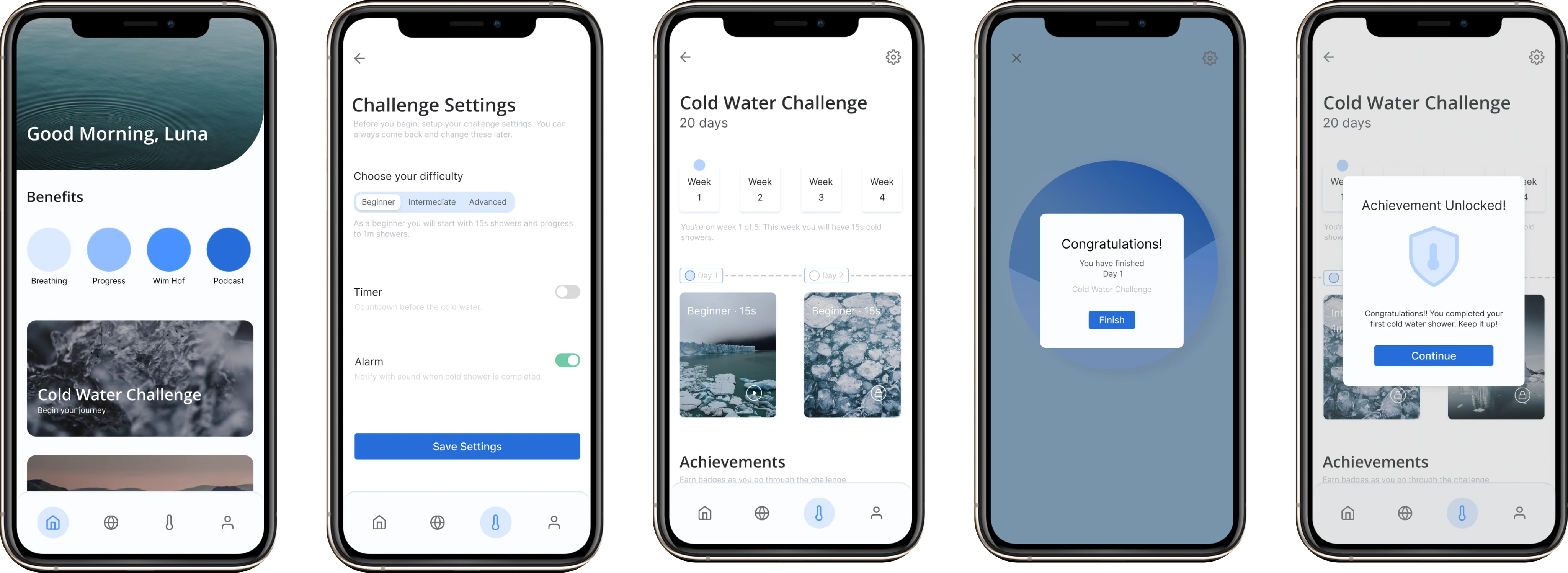
High Fidelity Prototype
Below is the final version of the prototype that we created. We included interactions and transitions in Figma to match the product's flow.
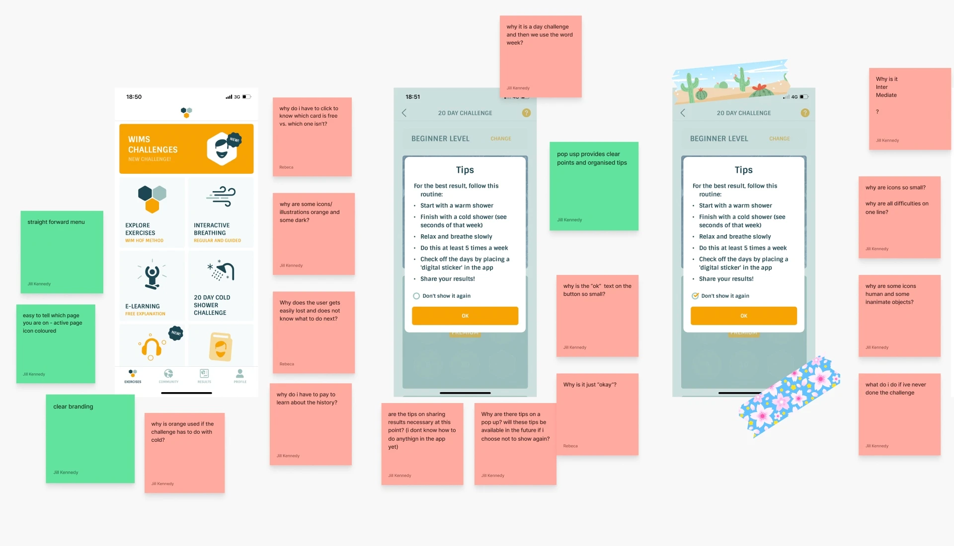
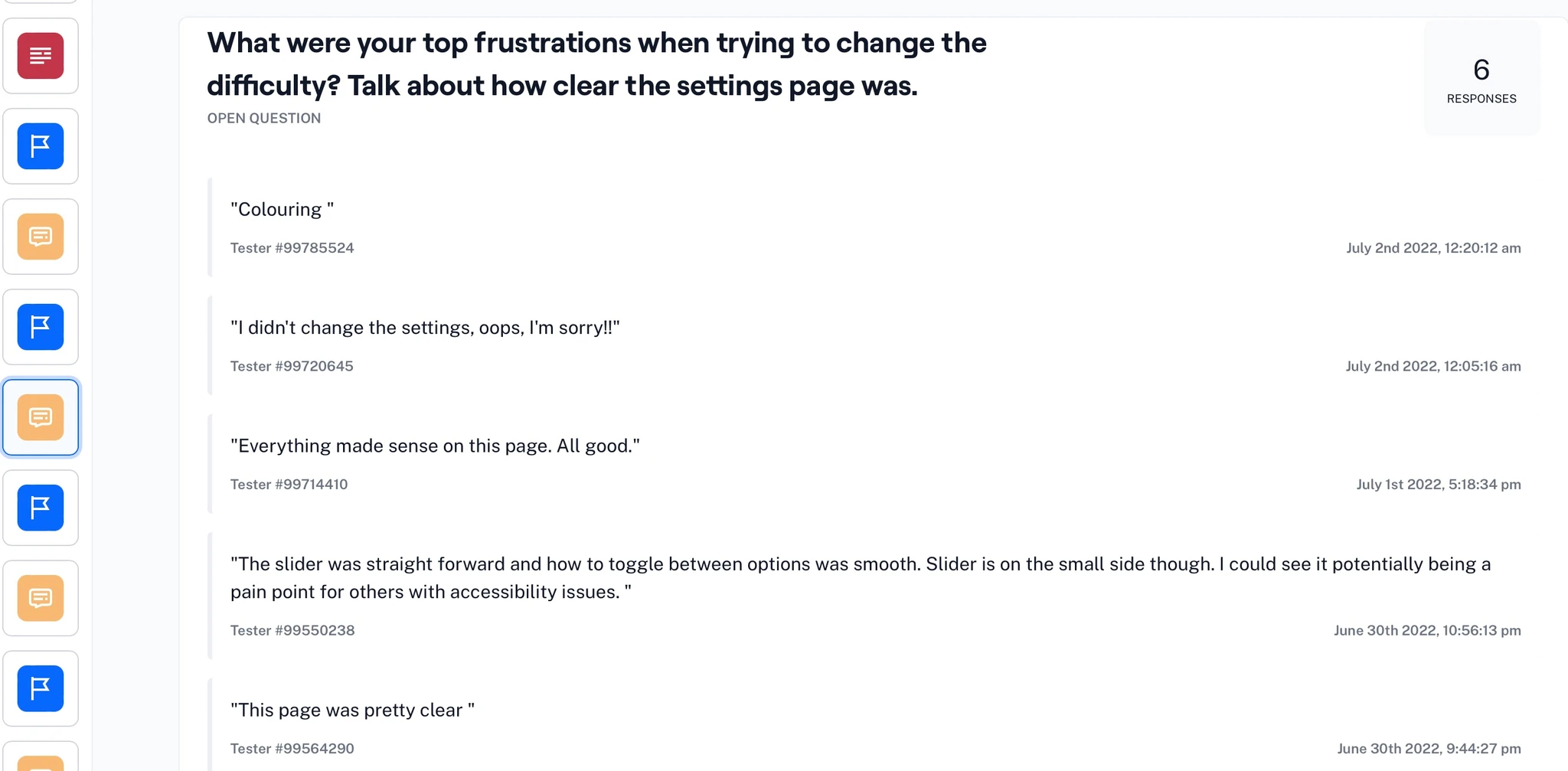
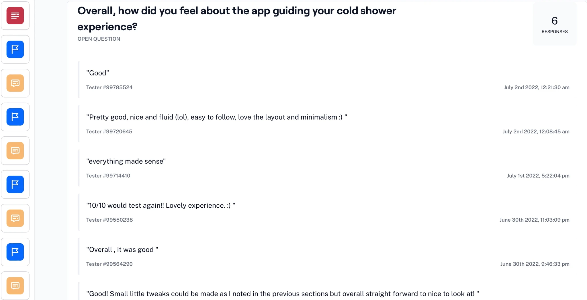
Usability Testing
To test the prototype we used Maze and gathered feedback following every task.
Test outcomes
After testing the prototype, we found that it was easier for users to find how to begin the challenge. However, based on the heat maps, we noted some users were trying to access the challenge via the circular options at the top of the home screen. Furthermore, some users mentioned that the colour differentiation needed to be starker, as it was difficult to see certain parts of the toggle and information.
Three key learnings
1. The "Start Challenge" option should be accessible at the top of the home screen.
2. Toggles should be bigger and use clear accent colours.
2. Users enjoyed the badge system and found it motivated them to continue.
Next steps
If we create another path to start the challenge and improve the settings pages, users will feel more motivated to start, complete and continue the challenge, enhancing the number of users converting to a paid subscription.