Building this portfolio
Portfolio as product — design system, CMS, versions.
The Brief
My previous portfolio started with a Framer template, and it did the job for a junior designer; it helped me land my first job. Three years later, I wanted to put into action what I have learned, personally and at my job and with the new use of AI to build something new. I wanted something different. I wanted a portfolio that felt like a product, something I'd actually keep building. Something with a design system, a CMS, versions, and with my style and personality.
The north star reference was carmen-elena.space, her portfolio shows its own git log on the homepage, treats its design system as a shippable artefact, and uses Notion as a live CMS. That concept of portfolio as product became the brief. Then I browsed other portfolios, apps, and sites for inspiration, and what started as a moodboard with collages of images, animations, colours, and a feeling, transformed into the portfolio you are visiting today.
The Stack
Before writing a line of code, I made the stack decision. The constraint was clear: it had to feel like a real product, not a website builder export.
| Tool | Role |
|---|---|
| Figma | Design system + component library, screen wireframes |
| GitHub | Where the code lives |
| Claude chat | Strategic design partner |
| Claude Code | Claude Code for implementation, where the actual building happened. |
| Claude MCPs | Figma, Chrome, Notion |
| Next.js + TypeScript | Frontend framework |
| Tailwind v4 | Utility-first styling |
| Framer Motion | Animation and motion |
| Notion | Headless CMS for case studies |
| Vercel | Deployment + preview environments |
| Procreate | Brushstroke assets for the locked card reveals |
| Lovable | Iteration of Widgets |
Notion as CMS
The key architectural decision: Notion as CMS. Case study content lives in a Notion database and is fetched at build time via the Notion API, so adding a new case study means writing in Notion, not touching code. The Notion database has 12 properties: slug, access level, card colour, brush asset, one-liner, year, and tags. The frontend queries Notion at build time and renders pages dynamically from /work/[slug].
The Design System — Marea DS
The design system came first. Before a single component was built, I needed the foundation. This is where the Figma-Claude MCP helped me the most.
I didn't build the full token system manually. I set the visual ground for things I knew the direction and feel I wanted, so I chose:
- Primary colors and core neutrals
- My type choices: the faces, the weights, the scale direction
- Border styles - radius, width, how sharp or soft things felt
- Key UI element decisions: what a card feels like, what a surface feels like
Then I handed it off to Claude. I asked Claude to finish the DS, token system in Figma: the full semantic colour system, tones, states, and the complete typography scale mapped to those choices. Claude wrote those tokens directly into my Figma file.
The palette
The name Marea (Spanish for tide) set the direction. I love the ocean, so that was the name I would use while building, but eventually, my portfolio became my name, Rebeca Peláez.
The palette had to feel oceanic: deep, calm, alive. I pulled from my moodboard: deep-ocean photography, cosmos/stars, lily pads (Monet), warm earth interiors, violet florals, glittery makeup, and playfulness. This moodboard inspired the calm but playful feel I wanted to achieve.
The result: a 14-token colour system across Core, Accent, and Surface groups.
Core ocean: Abyss #0F2A30 → Deep Tide #1C3D47 → Whale #3E7B8C → Seafoam #6DADA6
Accents: Cosmos #8A7ED4 (violet periwinkle) · Lavender #C8A8E0 · Coral #E8A090 · Terracotta #D4856A
Surfaces: Warm Sand #F5F1E8 · Linen #E8E0D0 · Driftwood #C8B89A
Typography
Three typefaces, each with a specific role:
- Fraunces — display and headings. Optical size axis, slightly quirky serif. Feels editorial and alive.
- Plus Jakarta Sans — body and UI. Clean, modern, legible at small sizes.
- DM Mono — metadata, tags, chips, overlines. Gives the system its technical edge.
- Homemade Apple — hero greeting only. The one moment of handwriting.
Semantic tokens and dark mode
The most important architectural decision in the DS: semantic tokens alias to primitives, never the other way around. Dark mode switching happens at the semantic layer via CSS variable overrides, no manual recolouring, no Tailwind dark: class sprawl.
This was hard-won. Early in the build, I had dark mode overrides in CSS classes (.dark .nav-liquid-blob) that Tailwind v4's Turbopack inlined at build time, making !important ineffective. The fix: inline style={{}} props via an isDark boolean in React for the few components where CSS couldn't reach. The lesson: semantic tokens are the only safe path for dark mode.
Motion tokens
Motion got its own token collection — Marea / Motion — with duration, content delay, and easing curve tokens.
- Enter: 450ms,
cubic-bezier(0.22, 1, 0.36, 1)— soft deceleration, ocean-reaching-shore - Exit: 350ms,
cubic-bezier(0.4, 0, 1, 1)— always ~70% of enter duration - Content delay: 200ms — so content fades in after the reveal starts, not simultaneously
The principle: exit is always faster than enter. Users have already seen the content. They don't need as much time to process it, leaving.
UI Decisions
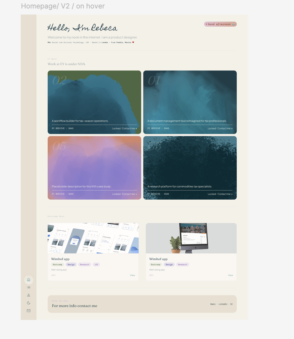
The Card System
The most considered component in the system is the work card, or rather, the two-sibling work card pair.
Why two siblings instead of one unified component
EY work is NDA-protected. Bootcamp work has full case studies. These two categories need fundamentally different media treatments: pure colour fields with brushstroke reveals for locked work, abstract gradient compositions for open work.
A unified Card component with an Access property would mean the media area has to switch between colour-header and image-header internally — complex, hard to reason about. Two siblings (card and card / locked) share DNA (typography, layout, motion, spacing) but keep their internals simple.
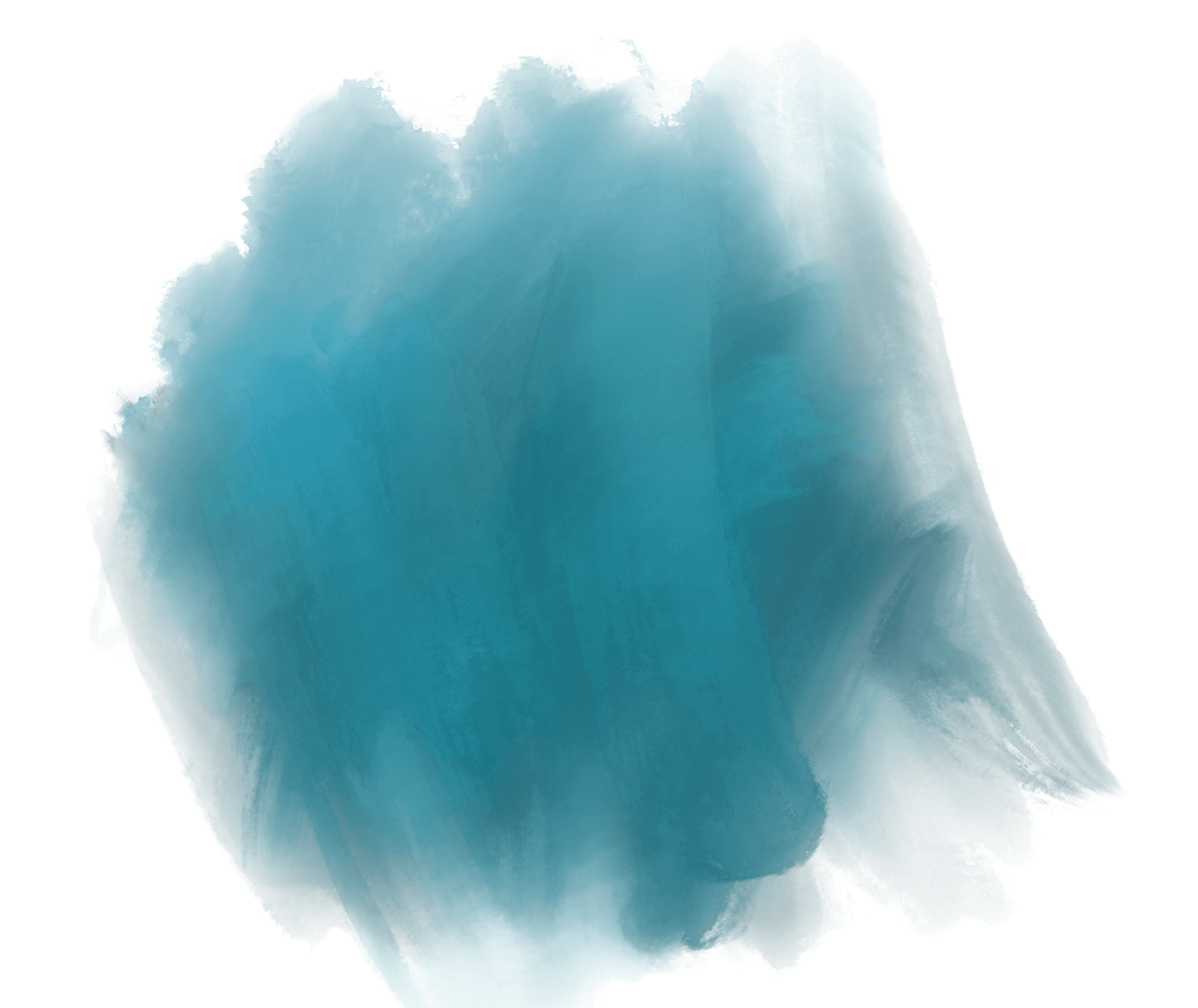
The brushstroke reveals
Locked cards reveal a Procreate-sourced brushstroke on hover. I created them in Procreate, and the idea was to make them appear on hover like an ocean wave on the beach or the first brushstroke on a canvas. A clip-path wipe animates from 100% to 0% on hover, giving the painted-ink-soaking-into-paper feeling.
Each of the five EY cards has its own brushstroke direction and style — identity, not configuration. Making them swappable would misrepresent the system.
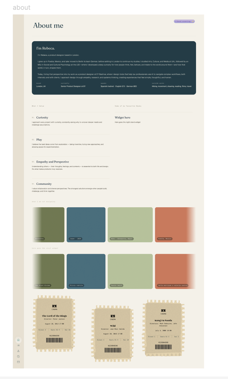
The Nav Bubble & fun widgets
I have fun widgets and details I wanted to add to show certain aspects of my personality or my hobbies. I love films, books, music, and anime, and I had the idea to display them in an interactive, animated way. For this, Lovable was key. Having a very rough idea in Figma and giving it to Lovable to animate and bring it to life was a great way to showcase it. Seen in the bubble nav bar, the greeting chip, the now listening chip in my about page alongside the bookshelf, the film tickets and the holographic anime cards. All fit perfectly into my about page. The sidebar navigation features a liquid glass bubble that travels between nav icons with a stretch animation. The tearing of film tickets to read my comments or clicking on one of my favourite books to read a quote, or hovering over an anime card to see the holographic effect. It all landed the way I was hoping.
The usual workflow for all was to prototype in a separate Lovable sandbox, then port it to the main repo via Claude Code.
The Workflow
The build workflow was: Basic wireframe of all screens in Figma → prototype in HTML with Claude’s help → approve design → write Claude Code prompt → commit → push → auto-deploy on Vercel.
Claude played two distinct roles:
- Strategic design partner — reasoning through decisions (why two card siblings instead of one, why Coral is reserved for contact CTAs only, whether the brushstroke direction should be configurable), generating HTML prototypes for visual decisions before touching the codebase.
- Implementation via Claude Code — writing ready-to-paste prompts that Claude Code (terminal agent) executes, reviews diffs, and commits with descriptive messages.
- Using MCP in Figma and Chrome and Notion - Claude and Chorme helped identify specific bugs early in the live Vercel site and in turn the chat could provide a specific prompt I could give to Claude Code. The MCP for Figma and Notion saved me time everytime I opened a new chat. Claude had access to my Notion CMS and could see and make suggestions, equally it could always reference my Figma file where the screens and DS were.
This separation matters. Claude Code doesn't make design decisions; it implements them. The conversation layer is where design thinking happens.
Key Decisions & Learnings
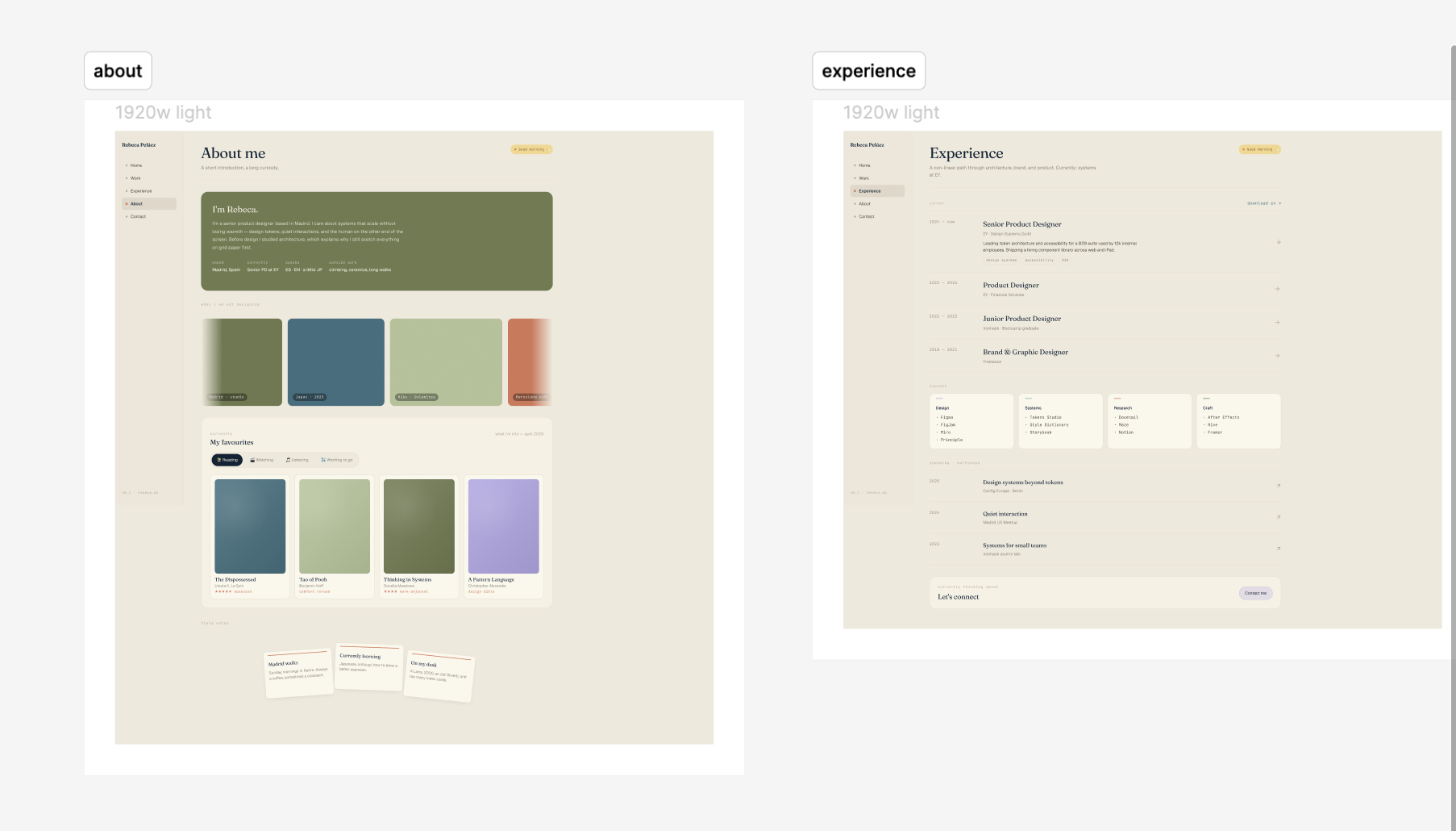
Starting on Figma first saved me time - It took me a month to complete this portfolio, but I started creating the frames on Figma, iterating and playing with colours and feel. I was glad I made this foundation decision because it helped me in the long term while using Claude.
Index pages are not pitch pages. The work index gives enough signal in 2 seconds to decide whether to go deeper. Spare default states, rich hover reveals.
Turbopack cache is aggressive. After every Claude Code session that touches CSS, run rm -rf .next && npm run dev to force recompile. Stale output caused multiple confusing debugging sessions.
GitHub image URLs must use raw.githubusercontent.com. Never blob URLs for images in my Notion CSM, or they render very slowly.
Some initial screens
Built with Next.js · Tailwind v4 · Framer Motion · Notion CMS · Vercel · Claude Code